Low Residency- one day monoprinting workshop

river project, Work in Progress

This slideshow requires JavaScript.

A one day monoprinting workshop during the Low Residency.
The photos above show the process of monoprinting- I started off with some large print outs of a few of the macro photos I took of the bones, and inked up a plate with a roller. To make the prints I put a sheet of paper down onto the inked up plate, with one of the print outs on top of that. I then carefully drew over the photo with a pencil, applying harder pressure to create a darker mark, and lighter pressure for lighter marks and shading. Unfortunately the first few attempts didn’t work so well, as the paper I had chosen to print on was too thick, so not a lot of the lighter details were picked up. I then experimented with different mark making techniques on the thick paper and also on newsprint, until I was happy.

The smaller print and ghost print* (rectangular shaped) were made by soaking the thicker paper in water and then making the prints, but due to the amount of detail I was trying to capture the paper dried before I finished the print, meaning it didn’t come out as well as I was hoping. I ran the plate through the press with the second soaked sheet any way, to make the ghost print (black print with white lines).

To make the larger, better print, and the ghost print made from that, I used newsprint, as it didn’t need to be soaked, and picked up even the lighter marks made on the paper. I spent about an hour and half on this print as I really wanted to capture all of the tiny details from the photograph, and overall I am pleased with how this came out! I then ran the plate through the press with a second sheet to get the ghost print. One of the issues with newsprint is how fragile it is, and also that it discolours over time, but this could work in my favour, as the gradual transition of the paper will mimic how bones discolour over time with age, which is quite beautiful.

For a one day project I am very pleased with how the prints came out, and I had fun with the process. I think based on these outcomes that the macro photos would look very beautiful if I photo etched them, so this is something I may consider doing in the future.

* a ghost print is a print made from the negative of the original print- in this case when you remove the sheet of paper from the inked up plate wherever you have made a mark the ink will have transferred to the paper, giving you a positive print. To make a negative you then run the plate through the press with another sheet of paper, and this gives you a negative or ‘ghost’ print.

Visit to Rafael Klein’s Studio

Tutorials


This slideshow requires JavaScript.


We visited the artist Rafael Klein’s studio space on the 6th February, to see how and where he makes his work. He discussed various public projects that he has been commissioned on- for example the maple leaves outside the Nag’s Head in Peckham, and his artistic practice, and juggling the various aspects working as an artist. His process involves filling entire sketchbooks, before selecting drawings to work into and take further- although some pieces starts as digital drawings done on his Ipad. He also takes commissions on videos made of his Ipad sketches- some are time-lapses and others are animations. We got to see his collection of artist books, all designed by him, and this was part of his practice he seemed most excited to talk about- it has rekindled my own interest in artist books, and I think I might put one together at the end of my river project to showcase all of the work I have made as part of it. As well as rekindling my interest in artist books I realised that I miss drawing, so that is something I want to try and do more of- I plan on attending the life drawing sessions held at uni on Mondays, and I want to do more observational drawings whilst I’m out too, as a way of generating ideas and waking up my creativity on the days when I am struggling with my mental health.

I have included photos of some of his work, in his garden, and his studio space above.

Unknown Landscapes

river project, Videos, Work in Progress


Shot with a macro lens on a DSLR camera, closeups of bones found along the river, using a moving light source to illuminate the bones. If anyone would like to create some sound to go with this video then please contact me! I have little experience in sound art and music, and would love to have some accompanying sound.

I am actually very pleased with how this work turned out, as it was only my second time using a macro lens, and I feel I captured the beauty and detail in the bones perfectly through this medium. For such a simple experiment I think I have created one of my favourite pieces of work, and I would like to explore this further in the future. My only regret is that currently the video has no sound, and I feel it could be greatly enhanced by it. I might go back to the spots where I found the bones along the river and record some of the sounds- I could then layer these sounds with the video and play around with it.

1 to 1 Tutorial 16/01/18

Tutorials

River Project:

  • moving away from vacuum forming as I feel I can get better casts in other materials due to the restrictions of vacuum forming, now moving towards metal, resin, plaster and ceramics
  • “The Detectorists” TV show
  • Mudlarking- how it has transitioned from a way for the very lowest of society to scavenge for survival, to a middle class pastime involving expensive permits and equipment
  • “Secret Lives of Colour” by Kassia ST Clair – reserve in library and read it
  • “Re-imagining Scott: Objects and Journeys” by Paul Coldwell – borrow from library and read
  • 3D scanning and printing- could work with some of my found objects
  • “Shop of Possibilities”

Perfect Victim:

  • focus on narrative, use simple, still illustrations and focus on the branches of the story and how player decisions affect the narrative
  • do interviews with woc, trans women, non binary people (who previously identified as femme/women)
  • use interviews as a base to write scenes in the game
  • Put call out for illustrator and games designer when ready

Video Game Inspo Pinterest Page and Gender Survey

Research for Perfect Victim, Work in Progress

Pinterest link

Gender Presentation and Discrimination Survey 

The top linked page is for visual references for the Perfect Victim video game project- I have played two games so far (Depression Quest and Dream Daddy) and taken screenshots and made accompanying notes on this Pinterest page, each with their own sub-section. I have also pinned visual references for the character creation I hope to include in my game, and other visual references from other games and artists for scenery/backgrounds/ect. This is so that once I find an illustrator and games designer/programmer to collaborate with they can see my inspiration and visual references collected in one place, as well as something for myself to refer back to.

The second link is for a survey I created as part of my research for this game, looking into how gender presentation can lead to discrimination (or not). I hope to see if people feel that how they present regarding gender (i.e. if they look more masculine or feminine) affects how they are treated by others. This is so that I can incorporate first hand experiences into my video game, to make it more realistic. I also need to write up a series of questions to ask women of colour, trans women, and people of other genders who present as more feminine(or who used to), in one to one interviews. I already have a few people who have volunteered to be interviewed, so I’m hoping these interviews will give me vital primary data and experiences to work into the game. I will ask the Student Union if they can do a mass email to UAL students and share my call for interviewees on social media so that I can reach a wider audience than just my current social circles.

TO DO:

  • Play the other games as research (screenshot and make notes during this)
  • Write up a series of questions for the one to one interviews
  • Get a call put out for interviewees so that I can start interviewing people asap
  • review the responses to my survey
  • Continue character write ups
  • Draft key scenes for the game
  • Find collaborators


WIP- White: The Gallery Space, and the Classism and Racism of the Art World

Research for River Project (White), river project, Work in Progress
  • Discuss my own work- why I chose white, and how the audience’s perceptions would be different if I had presented the original objects in the gallery space (photos of my work in the gallery space
  • Rachel Whiteread’s use of white concrete and other white materials in her work (photos from the Tate Britain retrospective)
  • ‘The Whiteness of the Whale; Moby Dick’ discuss this chapter and quote how it describes white:
    -‘In many natural objects, whiteness refiningly enhances beauty, as if imparting some special virtue of its own’
    -‘This same hue is made the emblem of many touching, noble things- the innocence of brides, the benignity of age’
    -Native Americans are described as “Red Men of America” – this is an old work of fiction, and is impacted by the racism of the time
    -He also acknowledges that white has negative connotations- ‘Witness the white bear of the poles, and the white shark of the tropics; what but their smooth, flaky whiteness makes them the transcendent horrors they are? That ghastly whiteness it is which imparts such an abhorrent mildness, even more loathsome than terrific’
    -‘The common, hereditary experience of all mankind fail to bear witness to the supernaturalism of this hue. It cannot be well doubted, that the one visible quality in the aspect of the dead which most appals the gazer, is the marble pallor lingering there’ – white has a deep link to death
    -‘Or is it that as in essence whiteness is not so much a colour as the visible absence of colour, and at the same time the concrete of all colours’
  • Adolf Loos- ‘Ornament and Crime’
    -The racism- comparing Papua New Guinean tribes to children and criminals, and later ‘Are we alone, the people of the nineteenth century, supposed to be unable to do what any Negroe. All the races and periods before us have been able to do?’ (Speaking of the apparent realization that the people (meaning white people) of the nineteenth century found themselves unable to produce ornamental designs. (The lecture was originally given in 1908)
    -‘The evolution of culture is synonymous with the removal of ornament from utilitarian objects.’ The idea that plain things are better definitely arose during the industrial revolution- everyone needed things faster, and objects with no ornament could be produced even more quickly. But he also talks of ‘peasants’ ‘in the country’ as holding on to objects of past centuries, I would argue because they cannot afford new things- he shows disdain for lower classes as well as people of colour
    -‘We have art, which has taken the place of ornament. After the toils and troubles of the day we go to Beethoven or to Tristan. This my shoemaker cannot do. I mustn’t deprive him of his joy, since I have nothing else to put in its place.’ Here we see him discussing his shoemaker, and how the shoemakers’ only joy comes from ornamenting his shoes with decorative patterns- it is incredibly patronising to the working class, as he is stating that they cannot enjoy art, they can only derive enjoyment from the job they perform for the upper class
    -‘Absence of ornament has brought the other arts to unsuspected heights’
    -‘Freedom from ornament is a sign of spiritual strength. Modern man uses the ornaments of earlier or alien cultures as he sees fit. He concentrates his own inventiveness on other things’

EDIT- References looked at Summer 2018

Depression Quest Play-through and Analysis

Research for Perfect Victim

depression q1.png

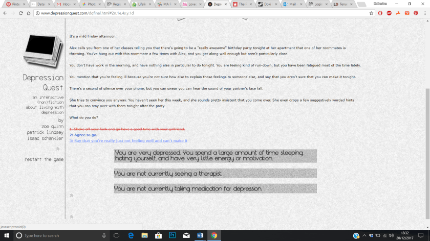
The beginning of the game, Depression Quest. The coloured options at the bottom are your possible reactions/interactions, and these vary depending on the route you choose as you play this game. The red option with the line through it means you cannot choose it, and depending on the route you choose throughout the game, more or less or the options become red.

depression q2.png

The grey boxes at the bottom give you information about your situation throughout the game-play – if you decide to see a therapist or try medication or adopt a cat (all options in the game) then this is reflected in the grey boxes at the bottom of the game.

depression q3.png

I think what struck me with this game is that as this part explains- nothing has really “happened” to the main character to cause the depression, it just sort of crept up on them, which is often what happens in real life- it hits home to the player that this really can happen to anyone.

depression q4.png

This is the part of the game where you have the opportunity to adopt a kitten, which if you say yes helps you to take care of yourself and the kitten, but if you decline nothing really changes. I felt that this was a powerful moment in the game, as it shows that sometimes even small things can make a huge difference to our wellbeing.

depression q5.png

This is one of the scenes that comes about if you choose the “bad” route, which can mean the end of your relationship. As you can see there are a lot of red options that you cannot choose- because of the negative options you have previously picked leading up to this moment.

depression q6.png

The “bad” ending, which I got to by choosing all the “negative” options throughout the game, it shows how difficult it can be dealing with mental illness on your own, and the toll it can take on your life.

Whilst this game is not visually engaging it is well written and tells the story well. I think it is a fairly accurate depiction of depression, from my own experiences, and it could be used as an educational tool for people who have not experienced depression if they wanted to try and understand what it is like to live with. I think I would like my game to be educational and well written, like this game, however I would like to make mine more visually engaging and stimulating for the player, with more interactive options. I feel this would open it up to people who cannot or prefer not to read large blocks of text, and would help to keep players interested as they play the game.

Dream Daddy Play-through

Research for Perfect Victim

This slideshow requires JavaScript.

Some screenshots from my first play-through of the video game Dream Daddy. I particularly like the character creation menu, especially as you can choose to be trans or cisgender, which is something I would like to have as an option in my own video game. The dialogue options are also well thought out, and make the game much more engaging- I like being able to choose what kind of personality my character has, and I like that this influences how other characters interact with you- this is something I really want to make key to my own game.

The visual style is also something I would like to emulate in my game as it is beautiful to play, and I hope I can find an illustrator with a unique style to help me realise my vision, as I do not think I could produce illustrations of such a high quality myself.

‘Hybrid.’ Work in Progress Exhibition

Exhibitions, Photographs, river project

This slideshow requires JavaScript.

‘Hybrid.’ was our first exhibition on the course, and it opened on Friday 1st December for one week at the Two Girls Cafe in Peckham, consisting of work from both first and second year of MA Fine Art Digital.

I worked very hard to get my work finished for the exhibition- it took a lot of testing to get the moulds exactly the way I wanted them, and there were still small things I couldn’t fix. For example, most of the plastic bottle is still trapped inside the mould, as the heat compressed it too much and although I tried to cut the bottle out of the mould I was only partly successful- this was something I had to live with as it was not visible from the side on display and any further cutting would have damaged the piece beyond repair. As it was both the brick and wood casts had a few small tears in the plastic, but I positioned the pieces on the wall so that they were not visible, and as the wall was white I think the tears went unnoticed. Plastic can be a very unforgiving medium, so overall I am pleased with how my moulds turned out- the rope mould in particular captured a lot of detail and was visually very pleasing. Also regarding the presentation I did not use a tape measure or a spirit level, which would have made my pieces look much more professional, so these are two pieces of equipment I plan on investing in for future exhibitions, to avoid my work looking amateurish. Due to the nature of how the hot plastic warped and bent it was very difficult to cut the pieces neatly and to the same size- I used the laser cutter, but also had to use a ruler and scalpel to cut some of the parts that were too curved. As a result each piece was a slightly different size and shape, as it was impossible to get them perfect which was frustrating, but something I had to live with. The pieces did for the most part sit well against the wall once nailed in place though, which I was pleased about.

I definitely need to be more involved with the class moving forwards, as I did not have much input into the exhibition, beyond my own work, and I feel I let myself and the class down because of this. I hope to rectify this coming back for term 2 in January by being more proactive, and attending as many lectures and tutorials as I am able, so that I can fully engage with my peers and the topics we cover.

I think the work I put into Hybrid is the very definition of work in progress- it represents a turning point in my thinking, and is indicative of the struggles I have experienced in the last few months- it was not perfect or as polished as I would have liked, but I am very proud of myself for persevering and finishing the pieces in time for the exhibition. Going forwards I definitely want to try recreating more of my found objects in other mediums, such as ceramics, plaster, metal, and resin, to explore how the objects change and take on a new medium in other media and colours. I originally planned this project to be purely focused on making and processes, but seeing my work on the wall of the gallery space made me question why I chose the colour white, and why it is so overused in the art world. This has led me to a new topic for research- How and why is white used in the art world, and does it link to the inherent classism and racism that dominates the art world?

Week 6 Summary

Weekly Summaries

Things I have achieved:

  • Further testing with the macro lens, including some filming using light and angles
  • further testing with vacuum forming, and a decision on what I would like to put into the exhibition from this
  • made one final piece out of a possible 4 for the exihibition

To do list:

  • Catch up with the last two weeks lectures
  • make the last 3 vacuum form pieces for the exhibition
  • compile the videos into one video and upload to Vimeo (then link to it on this blog)

This week has been incredibly bad, and I wish I had managed to get more finished pieces done, so I definitely need to kick myself into gear in the coming week