Self Portrait 1 and 2 at PEOPLE IN A ROOM, Peckham

ceramics, Exhibitions, FAT Project, The Kiln Rooms/Ceramic works

Unfortunately this is the only image I have of my work in the exhibition PEOPLE IN A ROOM, at Holdrons Arcade, Peckham. The exhibition is running 6th – 17th October and brings together works by artists living and working in Peckham, with events running during the exhibition within the space. The poster for the event and further information can be found here.

These two sculptures are titled Self Portrait 1 and Self Portrait 2 and they are both sculpted from white stoneware clay, and glazed in brilliant white and gloss white, respectively.

THIS IS NOT A SHOW, Virtual Exhibition WCCD X Pineapple Black Arts

Exhibitions, river project, WWCD

A little virtual tour of the online exhibition THIS IS NOT A SHOW, showcasing the work of over 50 working class artists and creatives from the Working Class Creatives Database at Pineapple Black Arts, with a brief look at my work included in the show.
‘๐”—๐”ฅ๐”ฆ๐”ฐ ๐”ฆ๐”ฐ ๐”ซ๐”ฌ๐”ฑ ๐”ž ๐”ฐ๐”ฅ๐”ฌ๐”ด. ๐”—๐”ฅ๐”ฆ๐”ฐ ๐”ฆ๐”ฐ ๐”ž ๐”ฐ๐”ฑ๐”ž๐”ฑ๐”ข๐”ช๐”ข๐”ซ๐”ฑ ๐”ฌ๐”ฃ ๐”ฆ๐”ซ๐”ฑ๐”ข๐”ซ๐”ฑ.โ€™
With workingclasscreativesdatabase.co.uk/
โšก๏ธlaunched on pineappleblack.co.uk/index.php/pbvarts/โšก๏ธ

๏ฟฝThe Working Class Creatives Database is a platform highlighting the work of people who are working class, giving a supporting structure to people that are involved in the arts.

๏ฟฝAs of 2020, only 16% of the workforce in creative industries identify as being from working-class backgrounds. By creating a platform for working-class creatives this begins to readdress these issues within the sector through creating a voice for those that are otherwise outsiders.

Special thanks to @pineappleblackarts for giving us a virtual space and @highbrowart for the poster design.

Feedback from WCCD Crit

FAT Project, Personal Projects, WWCD

I presented a sketchbook for a project I am working on called “Brown Bread Tastes Like Punishment” at the monthly Working Class Creatives Database online Zoom crit, and below is the feedback and the references I was given by other members of the WCCD on the call.

  • “Like the text and drawings- text is very punchy”
  • “Beautiful drawings”
  • Could I use the designs elsewhere- i.e. prints or zines?
  • Drawings capture a moment and record a memory- Ross said that the drawings triggers his own memories of his mum doing all kinds of diets, so viewers might have their own memories brought up when viewing the work, bringing their own things to it
  • drawings might be good with textures- paper mache, or ceramics like I showed on the Zoom call
  • try lots of things- film/prints/zines/sculptures/animation
  • catharsis through the physical act of making, versus the act of showing the work to others and opening yourself up to the feedback/criticism of others

REFERENCES TO CHECK OUT:

  • Lucy Sparrow
  • Jo Spence
  • Heather Philipson
  • Lindsey Mendick
  • Mystical Femmes
  • Mr Bingo
  • Sharona Franklin
  • Victoria Sin- drag artist, Glitch Feminism
  • “Virus” by Linda Stupart, gender, body, fatness

Some really helpful feedback that definitely made me feel more confident about this project as a whole- I entered the crit feeling like I didn’t have much to show and was unsure where to go with the project and ended up leaving it feeling much more confident in the ideas behind it, and possible avenues to take with it.

Covid Collages

Personal Projects

I made this series of postcards over the first lockdown using a mixture of illustration, hand writing and collage and have finally gotten round to scanning and cleaning them up on Photoshop to upload here and to my Instagram. These collages were made fairly quickly; acting as a way to get my worries, fears, and frustrations about lockdown and other things happening politically during this period of time out of my system and down on paper. I initially planned to send them to friends and family in the post, but ended up keeping them all. I find collage a useful way to make sense of my thoughts through found media (usually newspapers) and by limiting myself with the size of the postcard it enabled each one to represent a specific thought I had at the time.

in order, the collages above are titled:
1. “EVICTION IS JUST A PAYDAY AWAY”
2. “PANIC BUY TO STAVE OFF THE EXISTENTIAL DREAD”
3. “DING DONG THE WITCH IS DEAD”
4. “I’M FILLED WITH DREAD AT THE THOUGHT OF BEING A HOUSEWIFE”
5. “Quarantine 2020”
6. “GRABBING LIKE AN OCTOPUS”
7. “MENTAL HEALTH CRISIS”
8. ” TIME TO STRIKE, NO END IN SIGHT”

The collages above are titled:
1. ” BLOOD ON BORIS’ HANDS”
2. “JUSTICE FOR BELLY”
3. “WE WILL SURVIVE”

Tutoring Paper Workshop at 3rd Rail Print Space

Workshops

The images above are from the one day beginners Paper Printing workshop that I ran at 3rd Rail Print Space this weekend. This wasn’t the first time I have tutored a workshop, but it was the first time since before Lockdown, so I was a little nervous at first. We ended up having a slight hiccup where a few of the screens were exposed with the designs the wrong way round, but we managed to sort it out and get everyone finished on time with their limited edition of 10 prints, and we got good reviews! I am very pleased that I managed to handle the problem so well and it has made me feel a bit more confident in myself.

T-shirt Printing Workshop

Workshops

This weekend I assisted with a one day beginners t-shirt printing workshop at 3rd Rail Print Space!
We started off in the morning by running through the plan for the day, then encouraging everyone to either draw their design, or give us their digital design to edit on Photoshop before we printed it onto film for them. This was our first post-lockdown workshop so of course we had a few changes to make the the way we usually run the workshops- everyone needed to wear a mask at all times, we encouraged students to bring their own cups for hot drinks, and we offered gloves and hand sanitiser as well as adding extra cleaning into the day. We showed the students how to clean a screen ready for coating, and then we demonstrated how to coat a screen- usually we would then have each student coat their own screen, but to minimise the risks we had all the screens ready coated (apart from the demo screen we used). We then got everyone to bring in their artwork either on film or trace and lead them through the process of exposing artwork onto the screens and washing the emulsion off. Once the screens were in the dryer we then moved onto choosing and mixing colours, before breaking for lunch.

After lunch we took everyone through taping up their screens and setting up for the actual printing on the carousel, getting students to pair up to help each other print. Everyone left with their limited edition of 5 screen-printed t-shirts and were very happy!

BABEWORLD3000 Reading Group: Intro to “Taking Up Space”

Lectures/Talks, Reading Groups

TAKING UP SPACE EXCERPT

Notes made during the second BABEWORLD3000 reading group, reading the introduction to Taking Up Space: The Black Girlโ€™s Manifesto for Change by Chelsea Kwakye andย Ore Ogunbiyi

  • the expectations placed on minorities- remembering where you come from, but not allowing yourself to be tokenised
  • the pressure to succeed that others who are not marginalised will not experience, or at least not to the same degree
  • being black and British as a unique experience
  • “For as long as I can remember, I’ve loved the fact that no one could pin down my identity. I never wanted to have one defining characteristic. I wanted people to see that I could be all of them at once. I wanted to be complex, be able to change my mind, have opinions and interests that didn’t necessarily make sense all the time. My identity was never just me: it was perfect distillation of everyone around me.”ย 
  • the quote above particularly spoke to me as I have Borderline Personality Disorder- I find my personality becoming defined by different aspects of my identity, because I don’t know what else “I” am, and it often feels like my personality is made up of bits I have stolen from other people- certain opinions, likes, dislikes, that belong to people I know, rather than being my own
  • already exhausted by microaggressions and you then have to educate your peers every time your marginalised group is mentioned or discussed
  • reductive- reducing people down to one single aspect of their identity- i.e. being black, or working class, or disabled- you are a “black artist”, or “disabled artist”, ect- you become an involuntary spokesperson for that whole group of people
  • a lot of us talking about how to our families and friends we sound “posh” or “well spoken” but in the art world we never feel good enough, people point out our accents, ask where we are from, we have to change parts of ourselves to fit in, dilute our identities and break ourselves down into bite-size digestible chunks
  • maintaining the effort of being “presentable”
  • discussing how in the media black British people are rarely called British, despite being born here or having spent the majority of their lives here- for example the recent thing with the Windrush Generation, compare this to African Americans who are considered “American”. Also discussing the COVID19 pandemic currently happening and how the media is reporting the fact that British people of colour are dying at higher rates but skirting round the reasons why this is happening- institutionalised racism- and still refusing to call these people British. One example is a BBC News headline from a few days ago: “Coronavirus: Black African deaths three times higher than white Britons- study” – Why is it worded this way, as if to imply that they are not British?
  • having to hide disabilities and mental health issues to get into these institutions
  • people who have privilege often don’t want to acknowledge that they have privilege
  • “It would soon become my most defining characteristic, in a place in which I had thought I would have licence to explore every facet of my identity.” Obviously the author is talking about being black at uni, but for me it relates to being reduced to a few parts of my identity- i.e. being working class, fat, LGBTQ+ (when I eventually came out) and mentally ill. It felt like the only acceptable bit of identity that I could explore during my degree at uni was being queer, the other things were not seen as acceptable- I shouldn’t flaunt my fatness, or my mental illness, or be “too working class” whatever that means. Even in LGBTQ+ circles though, particularly in the LGBTQ+ society at my uni I was made to feel not “queer enough”- I hadn’t yet dated a woman or other genders apart from cisgender men, and I didn’t and still don’t look stereotypically “non-binary” (i.e. skinny, shaved head, masc clothes, wearing a binder to change my chest)
  • I made a conscious decision on my MA to be loud and outspoken about all aspects of my identity, but it is exhausting to always have to be that token person to bring up accessibility, classism, racism, ect
  • “As a minority in a predominantly white space, to take up space itself an act of resistance.”

Photoshop Experimentation

Personal Projects

3d_gif_attempt

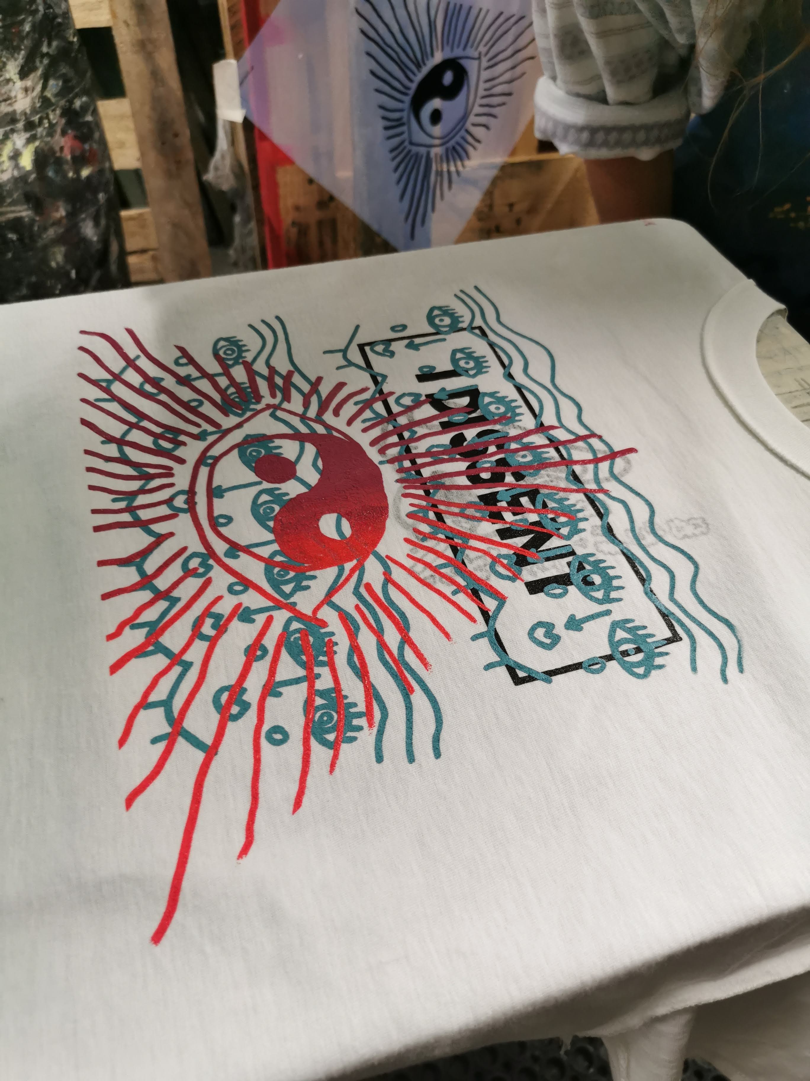
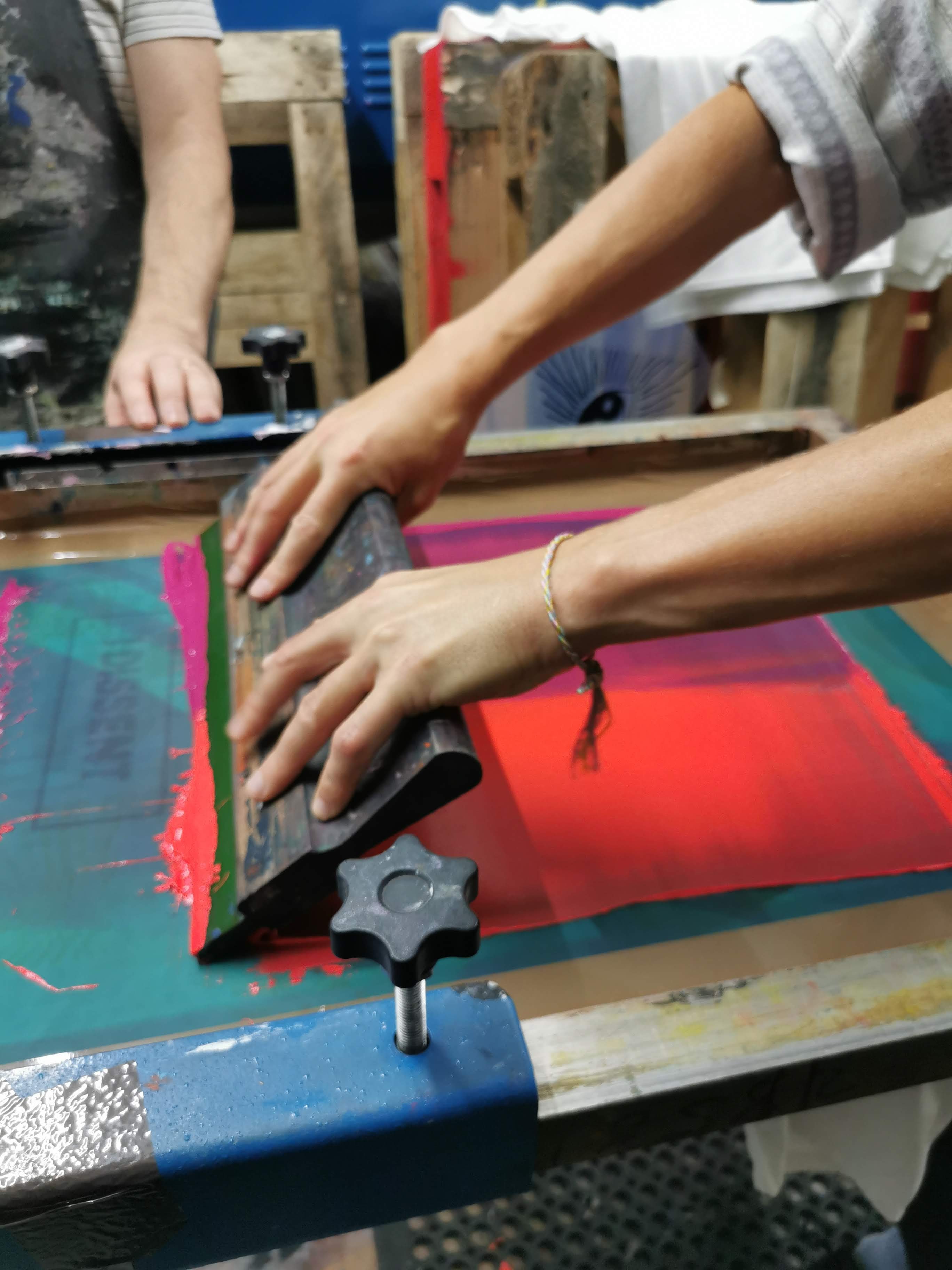
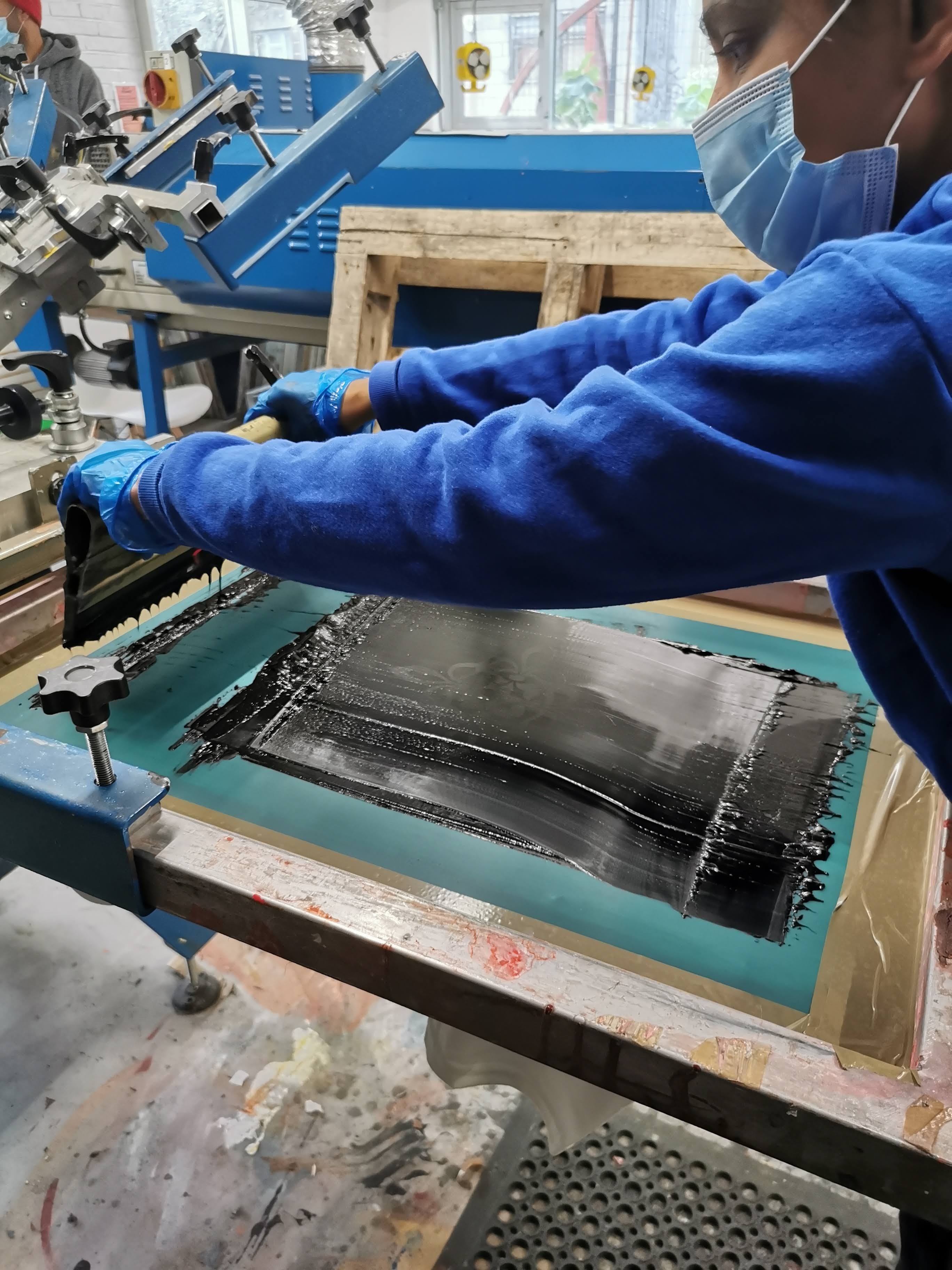
I am making a Redbubble account to sell some of my designs on, as all my work has been cancelled due to Covid19- I would prefer to print my designs onto products first i.e. via screen printing at 3rd Rail Print Space, but it is shut due to the pandemic and I need a form of income during this time.

I was playing around on Photoshop with the aim of making a banner for my Redbubble shop and to replace the gif banner currently on this blog. It was going to be a larger version of the one I already use, but as I was messing around on Photoshop I came across a way to make the text 3D, which I did, and then began playing around to animate it- resulting in this. I watched a few Youtube videos, but mostly just figured it out as I went.

Given it is my first time using the 3D functions on Photoshop and given how long ago I made the first gif I am really pleased with how this turned out, however I am working on it further as I want it to be a little bit slower (so it is easier for people to read) and I want it to flow a little better and look less clunky, so I’m going to keep working on it!2020-03-29.png

Print Job for Colleague

Commissioned Works, Internship at 3rd Rail

This slideshow requires JavaScript.

A colleague from the cinema asked me to print a two layer t-shirt and one layer jumper for him at the Print Space- he supplied me with the designs and clothing, and I prepped the designs, printed them onto film, prepped the screens, mixed the inks, then did the printing, as shown in the photos above!

He is very pleased with the outcome, as am I.

Research Into Creating For Wider Audiences

Accessibility Project, Internship at 3rd Rail

Dyslexia Friendlyย 

Key Points:

  • choose a more legible font- i.e. Arial, Comic Sans, Calibri, Open Sans (Sans Serifs preferable)
  • High contrast between text and background
  • larger font sizes and slightly bigger spaces between letters and words, and between lines of text (kearning/tracking/leading)
  • Off white neutral backgrounds with minimal patterns or pictures work best
  • Avoid uppercase/all caps/italics/underline, use bold if emphasis is needed
  • avoid green and red/pink as these are difficult for people with colour blindness
  • matt paper

Braille

Key Points:

  • tactile reading and writing system for visually impaired, blind, or deaf blind people
  • Braille symbols are formed with a matrix of up to six dots called a cell- a cell can be an individual letter, punctuation, number, or a whole word
  • uncontracted Braille- every letter is individually spelled out
  • contracted Braille- is like a form of shorthand Braille used for faster reading and to save paper
  • https://www.brailletranslator.org/

https://www.livingpaintings.org/
– These are books made for blind and visually impaired people, with the illustrations raised so that they can be touched and felt

https://thepurposelab.com/2014/09/5-tips-to-make-your-print-design-more-accessible/
– a helpful breakdown of the basics

Conductive ink
– could screenprint in conductive ink, creating an electrical circuit- this could be used to make my prints “speak” or something else?
https://www.bareconductive.com/news/make-sound-interactive-mural/
https://www.wired.com/2013/10/conductive-ink-turns-paper-into-musical-instruments/

Things I could try/consider for future print based works

  • could try printing and applying different textures to my work- flocking, foiling, or using puff binder? This would mean my prints are more tactile
  • print on off white paper and be mindful of colours used
  • print in Braille?
  • choose fonts that are easier to read
  • making larger scale prints than I normally would, to aid legibility

This is just some research to lay the ground work for the project, but I think it’s a good start and there is already a lot to think about and potentially experiment with!