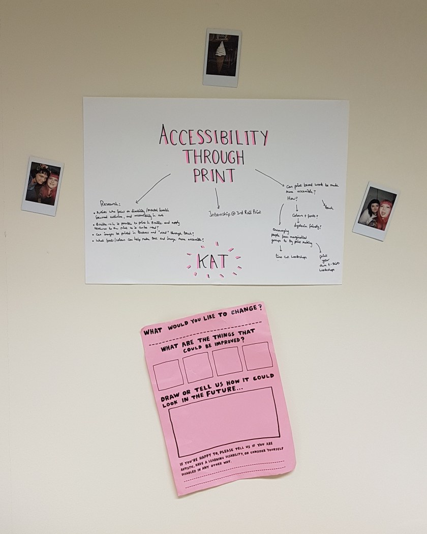
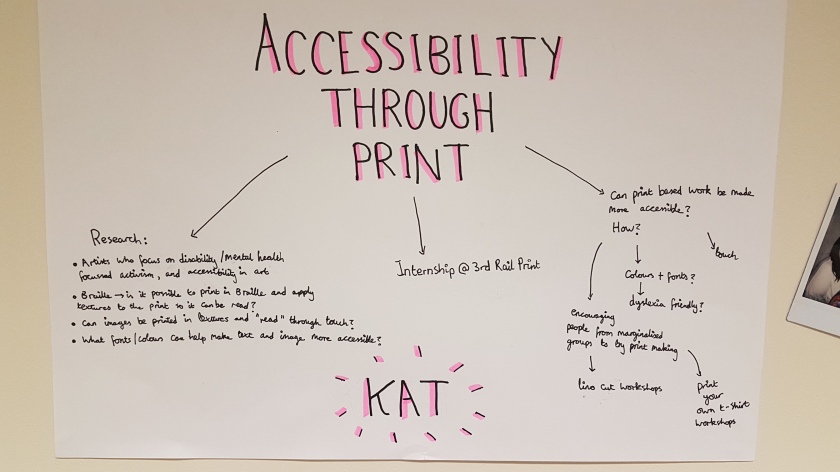
Research Into Creating For Wider Audiences

Accessibility Project, Internship at 3rd Rail

Dyslexia Friendly 

Key Points:

  • choose a more legible font- i.e. Arial, Comic Sans, Calibri, Open Sans (Sans Serifs preferable)
  • High contrast between text and background
  • larger font sizes and slightly bigger spaces between letters and words, and between lines of text (kearning/tracking/leading)
  • Off white neutral backgrounds with minimal patterns or pictures work best
  • Avoid uppercase/all caps/italics/underline, use bold if emphasis is needed
  • avoid green and red/pink as these are difficult for people with colour blindness
  • matt paper

Braille

Key Points:

  • tactile reading and writing system for visually impaired, blind, or deaf blind people
  • Braille symbols are formed with a matrix of up to six dots called a cell- a cell can be an individual letter, punctuation, number, or a whole word
  • uncontracted Braille- every letter is individually spelled out
  • contracted Braille- is like a form of shorthand Braille used for faster reading and to save paper
  • https://www.brailletranslator.org/

https://www.livingpaintings.org/
– These are books made for blind and visually impaired people, with the illustrations raised so that they can be touched and felt

https://thepurposelab.com/2014/09/5-tips-to-make-your-print-design-more-accessible/
– a helpful breakdown of the basics

Conductive ink
– could screenprint in conductive ink, creating an electrical circuit- this could be used to make my prints “speak” or something else?
https://www.bareconductive.com/news/make-sound-interactive-mural/
https://www.wired.com/2013/10/conductive-ink-turns-paper-into-musical-instruments/

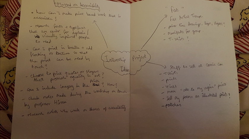
Things I could try/consider for future print based works

  • could try printing and applying different textures to my work- flocking, foiling, or using puff binder? This would mean my prints are more tactile
  • print on off white paper and be mindful of colours used
  • print in Braille?
  • choose fonts that are easier to read
  • making larger scale prints than I normally would, to aid legibility

This is just some research to lay the ground work for the project, but I think it’s a good start and there is already a lot to think about and potentially experiment with!

Residency at The Playground week 1

Accessibility Project, Internship at 3rd Rail, Residency at The Playground, Weekly Summaries

“The Playground is offering a 2-month summer residency for ten 2019 graduates from Camberwell, Chelsea and Wimbledon. This is a socially engaged residency and we invite creatives to be resident one to two days a week. The residency involves an exchange of four hours towards working with local communities in a public programme. This could include working towards a showcase of local peoples’ art, assisting at a public event, or contributing curation skills. The residency and the public programme will be coordinated by The Playground staff. As part of the summer residency graduates will get: • The opportunity to curate and exchange skills and creative practices with the local community through activities and events.
• Access to studio space at The Playground Monday-Friday 10am-6pm.
• Practice development through Careers and Employability and training on working with community groups.
• Kitchen access (free tea and coffee).
• The opportunity to be part of a pool of workshop leaders and assistants for further paid work.

About the Playground: The Playground is a space for us all to meet, hosted by Camberwell College of Arts, to share our interests and find ways to achieve new things together. In the coming months we aim to make things happen in this space for all ages through multi-arts events, showcasing opportunities, workshops and open access to lo-tech making and digital technologies.”

– info taken from The Playground Summer Residency application form

I applied for this residency and got it! As part of this I have given myself a project further exploring accessibility in the arts and the gallery space, leading on from my river project that I worked on during the MA. As I also have the internship at 3rd Rail Print Space I have decided to focus on accessibility in print. Print based work can be quite inaccessible for those with visual impairments, and reading and comprehension difficulties, such as dyslexia- so I want to challenge this and explore how we can make print based works more inclusive.

Here is a photo of my wall space behind my desk at The Playground, and a photo of what I’ve written up so far about this project:

IMG_20190812_183714_723.jpg20190812_175352.jpg

The pink sheet was taken from a current exhibition at the Wellcome Collection that I visited two weeks ago, and I think it helps to set the focus for this project.

Smoke and Mirrors: The Psychology of Magic

Accessibility Project, Exhibition Reviews, Residency at The Playground

This slideshow requires JavaScript.

” Explore how our biases affect our perception and whether our senses can be hacked. Discover spirit photography, magic props and psychology experiments to see how magic works on – and in – the mind of the spectator.

Artefacts on display from the world of magic include the head of the gorilla costume worn by Derren Brown, Harry Houdini’s ‘Bell Box’, Tommy Cooper’s fez, and Paul Daniels’s sawing-in-half box. ”
– Taken from the webpage

This exhibition is currently on at The Wellcome Collection, exploring the psychology of  magic tricks and illusions, examining modern and historical tricks through a scientific lens. I found it very fascinating, as like most people I was very fascinated with magic as a child, although it does spoil the fun a little to learn how it is done! I particularly enjoyed the video content in the booths (as shown in the photos) labelled Perception, Reasoning, and Memory as it explained the three aspects to magic tricks that utilise the flaws in our brains to make tricks seem believable. Each one broke down a different trick into its base components and it was actually super fascinating. I also really loved the old newspaper clippings and posters for magic acts- really aesthetically pleasing and I wish more art and advertising would hark back to this style and era. (Examples below)

This slideshow requires JavaScript.

The older films and photosets of tricks being broken down, shown, or disproved were also fascinating to see- it just goes to show how human beings interest in the unknown in universal, and I found it really curious how people who were well known for being supposedly rational were willing to suspend disbelief for magic and psychics. People such as Sir Arthur Conan Doyle, well known for his detective novels about the fictional detective Sherlock Holmes, were believers in the supernatural and mysterious- something that seems strange when you consider the quest for logic and scientific reasoning present in his books.

This slideshow requires JavaScript.

In terms of accessibility the exhibition had lots of engaging content, all with subtitles, was well laid out for wheelchair users and those with mobility aids to get around (although more seating would have been nice), and there were large format guide books available. There were plenty of videos that could be listened to for those with visual impairments, however nothing was available for visitors to touch, and as magic and illusory tricks are very visual by nature I think visitors with visual impairments might struggle to get as much from the exhibition as those without visual impairments. As someone who gets easily over stimulated by sound I found the exhibition manageable as some video pieces had headphones available, and none of the videos had audio that was overwhelmingly loud. I also found the subtitles on the videos very helpful. In terms of lighting it was quite dim all the way through, which might be to preserve the older photographs, and print based works, but it made it tricky to read some of the descriptions and might not be comfortable for people who struggle in low light conditions.